Streaming Platform Interfaces shape how you browse, search, and watch content. Netflix, Disney+, and Prime Video all use different design choices to guide your experience.
Layout, menu structure, and playback controls vary across these platforms. This guide compares what each one does well—and where they fall short.
Home Screen Design and Layouts
Each platform has a different approach to its home screen layout. The first screen you see influences how quickly you engage with content.
Netflix: Dynamic and Personalized
Netflix builds its home screen using personalized content rows. It includes a featured title at the top, followed by category-based lists like “Trending,” “Continue Watching,” or “Because You Watched.”
Titles auto-play when selected, which some users enjoy, while others disable it in settings. Content refreshes based on your history, and the UI prioritizes recent behavior.

The layout is clean and mobile-optimized, with high visual clarity. Netflix’s design emphasizes speed and ease of return viewing.
Disney+: Organized and Franchise-Centered
Disney+ opts for a structured homepage with clear hubs like Pixar, Marvel, and Star Wars. Each hub links to a curated experience with tailored visuals and subcategories.
The carousel banner at the top highlights new or featured releases. Rows are organized by genre, recently added, and collections.
The interface is visually consistent with large tiles and minimal clutter. Disney+ favors simplicity over deep personalization.
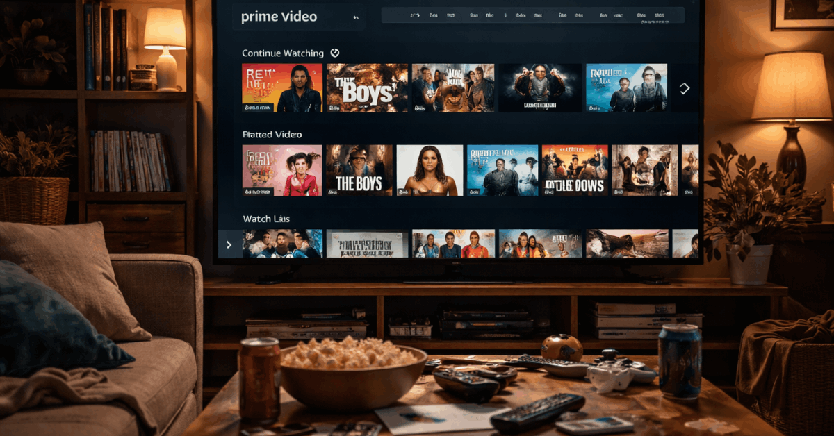
Prime Video: Packed and Mixed Content
Prime Video features a dense layout with promoted shows, Amazon Originals, rentals, and third-party titles intermixed. The homepage often includes ad-like banners for content upgrades.
The interface lacks visual spacing and clear labels separating free from paid options. Rows aren’t always sorted logically, which adds confusion.
Still, you can scroll deeply to find what’s trending or genre-specific. It’s powerful but can feel overwhelming at first.
Menus and Browsing Structure
How well a service helps you navigate determines how fast you find content. Menus and layout logic vary across platforms.
Netflix: Minimalist and Predictable
Netflix’s main menu is a vertical bar with tabs like Home, TV Shows, Movies, New & Popular, and My List.
It avoids clutter by keeping options minimal and hiding account settings under a submenu. Navigation feels natural whether you’re on mobile, TV, or desktop.
Genres and categories are presented through content rows, not buried menus. This design mitigates decision fatigue and maintains user engagement. You rarely get lost.
Disney+: Hub-Based Navigation
Disney+ uses large branded tiles for major franchises on the main menu. It includes simple tabs like Originals, Movies, and Series.
Genres are found by scrolling or entering a specific hub. This works well for fans of a brand but limits discovery beyond it.
The structure stays consistent across devices and is easy for families to use. Menu labels are clear, with good contrast for visibility.
Prime Video: Complex but Powerful
Prime Video offers tabs like Home, Store, Channels, Categories, and My Stuff. Each tab has dropdowns, creating multiple levels of navigation.
It gives users control, but at the cost of clarity. Rentals and purchases are mixed into these menus, which can frustrate users looking for free titles.
Still, there are genre filters, language filters, and Prime badge indicators. Once learned, the layout is flexible and content-rich.
Search Function and Filtering Options
Search tools help you find specific shows, actors, or genres quickly. The way platforms handle this varies in speed and depth.
Netflix: Fast and Predictive
Netflix auto-fills results as you type, showing matches for titles, actors, and genres. Results display cleanly with matching visuals and watch options.
If no match is found, Netflix suggests similar content instead. There are no filters, but it learns your typing habits over time. Search is consistent across all devices. Most results come back instantly.
Disney+: Simple with Tags
Disney+ allows basic search and shows recent or trending keywords. When you search for a franchise, it links directly to a content hub.
Filtering by genre or age range isn’t available in the search panel. You can discover collections by browsing instead.
The simplicity is good for casual use, but power users may find it limited. Search speed is reliable but lacks depth.
Prime Video: Detailed Filters but Busy Results
Prime Video includes a full-featured search bar with filters by genre, release year, language, and more.
It can surface results across free and paid content, with Prime-eligible markers. However, results often include unrelated options or duplicate entries.
Users need to scroll and select carefully. Search is fast but visually cluttered. It’s functional but lacks refinement.
Playback Experience and Player Features
Once content starts, the player’s design matters. Each platform includes custom options to enhance watching.
Netflix: Clean and Smart
Netflix’s player includes skip-intro, smart rewind, and autoplay next episode. Subtitle and audio settings are readily adjustable during playback.
The mobile app supports double-tap to skip and offline downloads. On TVs, the interface fades quickly, allowing full-screen immersion. Speed and responsiveness are consistent across devices. It’s built for binge sessions.
Disney+: Stable but Limited
Disney+ uses a basic player with standard controls and subtitles. It does not have skip-intro or next-episode buttons on all devices.
Downloads work well, but custom playback features are minimal. The design is consistent but lacks innovation.
Families find it simple, while power users may want more control. It remains stable even with weaker connections.
Prime Video: Feature-Packed
Prime Video’s player includes X-Ray, a unique tool that shows actor info, trivia, and soundtrack names.
It supports customizable subtitles, multiple audio tracks, and playback speed control. You can skip intros or jump to scenes in some titles.
On mobile, controls are compact but clear. The player is flexible but may overwhelm first-time users. Still, it’s a major strength.
Personalization and Profiles
Account customization affects recommendations and user flow. Each service handles this differently.
Netflix: Deep Learning and Individual Profiles
Netflix supports up to five profiles with tailored recommendations. Each profile evolves based on viewing, ratings, and watch time.
Parents can restrict content with PINs and age limits. The UI adjusts content rows and thumbnails per profile.
Users can even rename profiles and assign icons. Netflix offers the most personal experience.
Disney+: Clear Age Controls
Disney+ includes multiple profiles, with clear child restrictions. Kids’ accounts show only age-appropriate titles and simplified menus.
There’s less personalization beyond that. Profiles do not drastically change the interface. Still, it’s very user-friendly for families. It covers basic needs without adding complexity.
Prime Video: Basic Customization
Prime Video allows multiple profiles, but personalization is shallow. Watchlists and resume positions are kept separate, but recommendations feel shared.
You cannot fine-tune preferences as easily. Parental controls require deeper menu access. The UI changes slightly per profile, but not as clearly as Netflix. It’s functional, but basic.
Watchlists, Downloads, and Resume Tools
Managing what you’re watching is essential. Here’s how each platform handles it.
Netflix: Seamless Resuming and Auto Downloads
Netflix makes it easy to continue where you left off, across devices. The “Continue Watching” row stays prominent and updates quickly.
Smart Downloads lets you download episodes and automatically delete watched ones. Your list is easy to access and reorder. It syncs well across mobile and TV. Everything feels automatic.
Disney+: Manual but Consistent
Disney+ resumes playback accurately but lacks automation. You must manually download and manage titles.
Watchlists are easy to access but don’t offer sorting or priority tools. It syncs across devices without issue. Users have to put in more effort, but the tools work. It’s reliable for casual viewers.
Prime Video: Mixed Resume and Cluttered Lists
Prime Video supports resuming and has a continue row, but it sometimes includes rented or watched titles unnecessarily.
Downloads are fast, but the management interface is dated. The watchlist mixes movies, shows, and rentals with no filters.
Navigation to find recent titles can be slow. Power users may feel frustrated. It lacks polish but remains functional.
Final Verdict: Which Interface Works Best?
Streaming Platform Interfaces play a big role in shaping your overall viewing experience. Netflix stands out for its speed and personalization.
Disney+ keeps things clean, making it easy for families and casual users. Prime Video adds powerful features but feels less intuitive compared to the others.


