A streaming app can feel frustrating when simple choices take too much effort. Netflix, Disney+, and Prime Video all carry popular films and series, but their interface choices shape browsing, playback, and shared-household use differently.
This comparison helps viewers see which service feels easier on the device they use most. It looks past the catalog at the small moments that make viewing simple, busy, personal, or unexpectedly expensive.
The First Screen Reveals Each Service’s Priorities
A home screen tells viewers how a service expects them to choose. Personal history, content brands, and catalog access shape that choice differently

Netflix Leads With What You Already Started
Netflix puts unfinished programs and recommendation rows near the center of the screen, so returning viewers can continue quickly.
Its recommendations system uses profile activity to suggest titles, which is useful when someone wants a familiar kind of show but cannot name one. That makes Netflix comfortable for frequent viewers but occasionally repetitive for genre explorers.
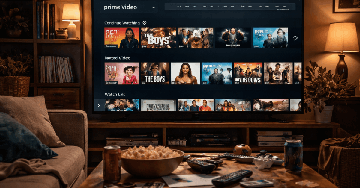
Disney+ And Prime Video Start From Different Assumptions
Disney+ uses large hubs for Disney, Pixar, Marvel, Star Wars, and National Geographic, making it easy to begin with a familiar content world.
Prime Video presents a broader mix of included titles, rentals, purchases, channels, and promotional options, which creates more possible routes but requires more label-checking.
The difference becomes clear when a family wants an easy film night while another viewer is happy to compare several ways to watch.
Browsing Feels Different When You Do Not Know The Title
Many viewers open an app with only a mood or actor in mind. The better interface gives direction without pages of unrelated offers.
Netflix And Disney+ Keep Search Relatively Focused
Netflix search is quick when someone remembers part of a title, an actor, or a genre, and its suggestions often connect to familiar viewing patterns.
Disney+ works well for known franchises because a character or film search can lead naturally into nearby series and collections. Viewers gain faster answers but give up some fine-grained control.
Prime Video Gives More Information Than Some Viewers Need
Prime Video search can help viewers find titles by language, genre, availability, rental status, or connected channels.
The trade-off is that search results can look crowded, especially when a popular film appears beside paid and add-on versions. Before choosing, check how the title is offered and whether it is included in the subscription you already have.
Playback Controls Matter After The Decision Is Made
Once a show starts, the player should support the story rather than compete with it. Subtitle access, resume behavior, and extra information can influence how comfortable an ordinary viewing session feels.
Also read: Streaming Services Explained for Casual Viewers
Netflix And Disney+ Keep The Screen Calm
Netflix makes common actions such as skipping an introduction, changing subtitles, and moving to the next episode easy to find.
Disney+ takes a similarly straightforward approach, with a clean player that suits families who do not want extra settings covering the scene.
Its profile tools also let account holders manage playback and language settings alongside parental controls.
Prime Video Is Better For Viewers Who Like Context
Prime Video’s X-Ray feature can surface cast details, music, and scene information while a title is playing on supported devices.
That is useful when someone likes to identify an actor or song without opening another app. Prime Video suits people who value on-screen context more than a minimal playback view.
Shared Homes Need More Than A Good Recommendation Row
Profiles and saved lists matter once several people use the same account over time. They determine whether each viewer sees a useful starting point or a home screen crowded with someone else’s unfinished shows.
Netflix Builds The Strongest Personal Separation
Netflix profiles can keep recommendations, watch history, maturity settings, and saved titles separate for different people.
The service also lets a viewer remove a title from Continue Watching, which helps when someone sampled a film and immediately lost interest. This creates individual viewing lanes and a cleaner return experience across devices.
Disney+ Favors Straightforward Family Boundaries
Disney+ profiles include parental controls, content ratings, and Junior Mode, which are practical for homes with younger viewers.
Prime Video also supports profiles and watchlists, though lists may contain a mixture of included titles, rentals, and channel content.
Families should value clear content limits and easy list management before deciding which experience will feel calmer every week.
Choose The Interface Around Your Actual Routine
There is no universal winner because the best layout depends on how people in the home watch. Think about the small frustrations you want to avoid, not only the number of films promised in the catalog.
Match The Service To The Way You Usually Decide
Netflix may suit viewers who open the app regularly and want a quick path back to a familiar series. Disney+ may fit families, younger viewers, and franchise fans who like recognizable hubs and fewer visual distractions.
Prime Video may suit people who want rentals, channel add-ons, and X-Ray, as long as they are comfortable checking availability labels. Use this brief viewing check to compare the daily experience:
- Netflix: personalized rows and rapid resuming.
- Disney+: simple hubs and family settings.
- Prime Video: wider options with more labels.
Test The App On The Device You Use Most
A feature chart cannot show how an app feels with your television remote, internet connection, and household habits.
Search for one familiar title, change a subtitle setting, add a program to a list, and see whether the steps are obvious.
This short trial reveals real usability and practical annoyances before you build a longer routine around one service.
Conclusion: Choose The App That Removes The Most Friction
Netflix suits personalized browsing and steady episode viewing. Disney+ may feel more comfortable where family controls and familiar franchises matter.
Prime Video provides broad access and X-Ray, but viewers should check whether titles are included. Test each service on your usual device and keep the one that makes a weeknight search feel shorter.


